Material You in Jetpack Compose
Learn how to use the amazing features that come with the new Material Design 3 to create better-looking apps with a more personal feel. By Harun Wangereka.
Sign up/Sign in
With a free Kodeco account you can download source code, track your progress, bookmark, personalise your learner profile and more!
Create accountAlready a member of Kodeco? Sign in
Sign up/Sign in
With a free Kodeco account you can download source code, track your progress, bookmark, personalise your learner profile and more!
Create accountAlready a member of Kodeco? Sign in
Contents
Material You in Jetpack Compose
25 mins
- Getting Started
- Understanding Material Design 3
- Material Design 3 & Android 12
- Migrating From Material Design 2
- Understanding Material You
- Using Material Theme Builder
- Applying Material Theme Builder Colors
- Applying Dynamic Color
- Using Material Motion in Your App
- Understanding Transition Patterns
- Adding Fade Animations to ColorPicker AlertDialog
- Adding Animation to Text
- Adding Transitions on Navigating Between Destinations
- Using Accompanist in Your App
- Adding Transitions to the Home Screen
- Adding Transitions to Event Input Screen
- Where to Go From Here?
The release of Android 12 brought lots of new features for app developers. The introduction of Material Design 3 was one such addition. Material Design 3 brings a lot of capabilities in the way you approach theming and styling for your apps.
It adds capabilities for users to customize and personalize the colors of their apps. The new approach enables the app to adapt to the user’s set wallpaper. It also introduces lots of improvements to existing Material Design Components.
In this tutorial, you’ll build the ComposeMaterialYou app. The app allows you to create and view calendar events.
During the process, you’ll learn:
- Using Material Design 3 and understanding component changes it brings.
- Migrating from Material Design 2.
- Using Material You personalization features and Material Theme Builder.
- Transition patterns and how to use them in your app.
- Adding Material Motion to your app.
For Android development, check out these Getting Started with Android tutorials and the book Android Apprentice.
If you’re new to Material Design, head over to Introduction to Material Design With Kotlin.
In case you haven’t got your hands dirty with Jetpack Compose yet, start with Jetpack Compose Tutorial for Android: Getting Started.
Getting Started
Download the starter project by clicking Download Materials at the top or bottom of the tutorial.
Open Android Studio Bumblebee or later and import the starter project. Build and run the project. You’ll see the following screens:
Since you don’t have any events, you’ll see the No events created message. The other screen is for adding a new event. The app isn’t fully functional yet. You’ll add functionality as you proceed with this tutorial.
Understanding Material Design 3
Every Material Design version adds new amazing features to help developers create even better UIs for their apps. Material Design 3 is no different. It introduces a new set of capabilities to adapt to users’ preferences, allowing users to customize the appearance of most things on their phones. It also provides app support in a more personal feeling, something that wasn’t possible before.
Material Components have a lot of updates too. All these changes will be available to Android 12 users first.
Material Design 3 & Android 12
Android 12 comes with a lot of changes. To highlight some of them:
- Better accessibility support.
- Support for foldable devices.
- Ability to customize the operating system and give it a personal feel.
- Introduction of dynamic color, which enables you to personalize the colors in your apps.
- Very responsive UI.
Including these new features into your apps can give the user a deeply personalized experience.
Migrating From Material Design 2
First of all, you need to have an access to the Material Design 3 library. Make sure you have this dependency in your app build.gradle file:
implementation "androidx.compose.material3:material3:$latest_material_3_version"
This is the Material Design 3 dependency. You can find the latest version on the AndroidX Releases page.
In addition, you need to ensure your app uses the correct imports for all the Material Components. The components should use the androidx.compose.material3
package namespace.
Ready to dive into the migration? Firstly, in your app build.gradle file, set the targetSdkVersion
to 31 for Android 12 compilation support. Upgrading targetSdkVersion
forces you to set android:exported="true"
in all your activities in the manifest file.
Then, focus on styles. In styles.xml, replace Theme.MaterialComponents.*
with Theme.Material3.*
for themes and Widget.MaterialComponents.*
with Widget.Material3.*
for widget styles.
Lastly, migrate your colors to the Material3
theme. You also need to add the additional colors for Material Design 3 to support dynamic colors. You’ll see these color changes later in this tutorial.
Typography has also been simplified. The typography variations are now small, medium and large. The Material Components have also gone through some updates. You can read more about the components in this migration to Material Design 3 guide.
Now that you have a bit of background on Material Design 3, you’ll look at Material You.
Understanding Material You
Material You is a new addition in Material Design 3. It focuses more on aspects like personalization and adaptability. Material You makes it easy to customize your app, and it’s also very responsive.
To generate the color scheme that can map with your newly used Material Design 3 components, you’ll use the Material Theme Builder tool.
Using Material Theme Builder
Material Theme Builder is a tool that helps you generate and visualize themes using Material You guidelines. It has a Figma plugin and a web platform too.
Head over to your browser app and open the Material Theme Builder Tool.
As you see in the screen above, you have two tabs at the top — DYNAMIC and CUSTOM. With the first one you can generate your colors from your wallpaper dynamically, and with the second one you can pick the colors manually.
In this tutorial, you’ll choose colors without wallpaper. Click the CUSTOM tab at the top and you’ll see:
By default, the screen shows a set of custom colors that you can change. You’ll change the primary color to:
#006d37
To do this, right-click the primary color circle:
Then, input the color hex code from above and click OK:
After that, your result should be something like this:
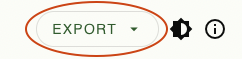
Now, your color scheme is ready to export. Click EXPORT at the top-right corner and select Jetpack Compose (Theme.kt).
You just downloaded a zipped file. Navigate to the file and uncompress it. After uncompressing the zip archive, you’ll see these files:
Open the files in your favorite IDE or editor to see the contents.
Applying Material Theme Builder Colors
You’ll now add the colors generated in the Material Theme Builder tool to your app. First, you’ll start with the light theme colors.
CamelCase
. However, the Material Theme Builder tool provides color names in the snake_case
form. To simplify next steps and skip renaming a bunch of variables, you’ll use predefined names.
Navigate to presentation/theme/Color.kt. Replace // TODO ADD Material Theme Builder Colors
with:
// Material Theme Light Builder Colors
val md_theme_light_primary = Color(0xFF006d37)
val md_theme_light_onPrimary = Color(0xFFffffff)
val md_theme_light_primaryContainer = Color(0xFF96f7b2)
val md_theme_light_onPrimaryContainer = Color(0xFF00210c)
val md_theme_light_secondary = Color(0xFF506353)
val md_theme_light_onSecondary = Color(0xFFffffff)
val md_theme_light_secondaryContainer = Color(0xFFd2e8d3)
val md_theme_light_onSecondaryContainer = Color(0xFF0d1f12)
val md_theme_light_tertiary = Color(0xFF3a656f)
val md_theme_light_onTertiary = Color(0xFFffffff)
val md_theme_light_tertiaryContainer = Color(0xFFbeeaf6)
val md_theme_light_onTertiaryContainer = Color(0xFF001f26)
val md_theme_light_error = Color(0xFFba1b1b)
val md_theme_light_errorContainer = Color(0xFFffdad4)
val md_theme_light_onError = Color(0xFFffffff)
val md_theme_light_onErrorContainer = Color(0xFF410001)
val md_theme_light_background = Color(0xFFfbfdf7)
val md_theme_light_onBackground = Color(0xFF1a1c1a)
val md_theme_light_surface = Color(0xFFfbfdf7)
val md_theme_light_onSurface = Color(0xFF1a1c1a)
val md_theme_light_surfaceVariant = Color(0xFFdde5db)
val md_theme_light_onSurfaceVariant = Color(0xFF414941)
val md_theme_light_outline = Color(0xFF717971)
val md_theme_light_inverseOnSurface = Color(0xFFf0f1ec)
val md_theme_light_inverseSurface = Color(0xFF2e312e)
val md_theme_light_inversePrimary = Color(0xFF7bda98)
val md_theme_light_shadow = Color(0xFF000000)
These are the colors from the Material Theme Builder tool for your light scheme.
After that, you’ll add dark scheme colors, which are still from the Material Theme Builder tool.
Below your light scheme colors, add:
// Material Theme Dark Builder Colors
val md_theme_dark_primary = Color(0xFF7bda98)
val md_theme_dark_onPrimary = Color(0xFF00391a)
val md_theme_dark_primaryContainer = Color(0xFF005228)
val md_theme_dark_onPrimaryContainer = Color(0xFF96f7b2)
val md_theme_dark_secondary = Color(0xFFb6ccb8)
val md_theme_dark_onSecondary = Color(0xFF223527)
val md_theme_dark_secondaryContainer = Color(0xFF384b3c)
val md_theme_dark_onSecondaryContainer = Color(0xFFd2e8d3)
val md_theme_dark_tertiary = Color(0xFFa2ceda)
val md_theme_dark_onTertiary = Color(0xFF023640)
val md_theme_dark_tertiaryContainer = Color(0xFF204d56)
val md_theme_dark_onTertiaryContainer = Color(0xFFbeeaf6)
val md_theme_dark_error = Color(0xFFffb4a9)
val md_theme_dark_errorContainer = Color(0xFF930006)
val md_theme_dark_onError = Color(0xFF680003)
val md_theme_dark_onErrorContainer = Color(0xFFffdad4)
val md_theme_dark_background = Color(0xFF1a1c1a)
val md_theme_dark_onBackground = Color(0xFFe2e3de)
val md_theme_dark_surface = Color(0xFF1a1c1a)
val md_theme_dark_onSurface = Color(0xFFe2e3de)
val md_theme_dark_surfaceVariant = Color(0xFF414941)
val md_theme_dark_onSurfaceVariant = Color(0xFFc1c9bf)
val md_theme_dark_outline = Color(0xFF8b938a)
val md_theme_dark_inverseOnSurface = Color(0xFF1a1c1a)
val md_theme_dark_inverseSurface = Color(0xFFe2e3de)
val md_theme_dark_inversePrimary = Color(0xFF006d37)
val md_theme_dark_shadow = Color(0xFF000000)
val seed = Color(0xFF00753e)
val error = Color(0xFFba1b1b)
These are the colors from the Material Theme Builder tool for the dark scheme. Your color schemes are ready for use now.
Head over to presentation/theme/Theme.kt and replace your LightThemeColors
variable with:
private val LightThemeColors = lightColorScheme(
primary = md_theme_light_primary,
onPrimary = md_theme_light_onPrimary,
primaryContainer = md_theme_light_primaryContainer,
onPrimaryContainer = md_theme_light_onPrimaryContainer,
secondary = md_theme_light_secondary,
onSecondary = md_theme_light_onSecondary,
secondaryContainer = md_theme_light_secondaryContainer,
onSecondaryContainer = md_theme_light_onSecondaryContainer,
tertiary = md_theme_light_tertiary,
onTertiary = md_theme_light_onTertiary,
tertiaryContainer = md_theme_light_tertiaryContainer,
onTertiaryContainer = md_theme_light_onTertiaryContainer,
error = md_theme_light_error,
errorContainer = md_theme_light_errorContainer,
onError = md_theme_light_onError,
onErrorContainer = md_theme_light_onErrorContainer,
background = md_theme_light_background,
onBackground = md_theme_light_onBackground,
surface = md_theme_light_surface,
onSurface = md_theme_light_onSurface,
surfaceVariant = md_theme_light_surfaceVariant,
onSurfaceVariant = md_theme_light_onSurfaceVariant,
outline = md_theme_light_outline,
inverseOnSurface = md_theme_light_inverseOnSurface,
inverseSurface = md_theme_light_inverseSurface,
inversePrimary = md_theme_light_inversePrimary,
)
In this code, you add the color values for all lightColorScheme
attributes available in the new Material Design 3 library.
Next, replace the DarkThemeColors
variable with:
private val DarkThemeColors = darkColorScheme(
primary = md_theme_dark_primary,
onPrimary = md_theme_dark_onPrimary,
primaryContainer = md_theme_dark_primaryContainer,
onPrimaryContainer = md_theme_dark_onPrimaryContainer,
secondary = md_theme_dark_secondary,
onSecondary = md_theme_dark_onSecondary,
secondaryContainer = md_theme_dark_secondaryContainer,
onSecondaryContainer = md_theme_dark_onSecondaryContainer,
tertiary = md_theme_dark_tertiary,
onTertiary = md_theme_dark_onTertiary,
tertiaryContainer = md_theme_dark_tertiaryContainer,
onTertiaryContainer = md_theme_dark_onTertiaryContainer,
error = md_theme_dark_error,
errorContainer = md_theme_dark_errorContainer,
onError = md_theme_dark_onError,
onErrorContainer = md_theme_dark_onErrorContainer,
background = md_theme_dark_background,
onBackground = md_theme_dark_onBackground,
surface = md_theme_dark_surface,
onSurface = md_theme_dark_onSurface,
surfaceVariant = md_theme_dark_surfaceVariant,
onSurfaceVariant = md_theme_dark_onSurfaceVariant,
outline = md_theme_dark_outline,
inverseOnSurface = md_theme_dark_inverseOnSurface,
inverseSurface = md_theme_dark_inverseSurface,
inversePrimary = md_theme_dark_inversePrimary,
)
Here, you add darkColorScheme
attributes for your theme. These colors, in combination, enable dynamic color support and personalization. Great job!
Now, build and run your app.
The app now has the right combination of your brand colors that maps perfectly with Material You. You can customize them as much as you want, taking advantage of the Material Theme Builder that lets you see all your color changes. The app now looks awesome, you should be proud of yourself! :]
Applying Dynamic Color
To support Material You even more deeply, you can make your app ready for dynamic colors. This is a color extraction mechanism that allows your app to use an auto-generated color scheme that resembles the user’s set wallpaper, but this only works for Android 12 devices.
Navigate to presentation/theme and open Theme.kt. This class is where you set your themes for your app.
Now, change colors in ComposeMaterialYou by replacing the colorScheme
variable, just below // TODO Add Dynamic Color Support
, with the following:
// 1
val dynamicColor = Build.VERSION.SDK_INT >= Build.VERSION_CODES.S
// 2
val colorScheme = when {
dynamicColor && darkTheme -> dynamicDarkColorScheme(LocalContext.current)
dynamicColor && !darkTheme -> dynamicLightColorScheme(LocalContext.current)
darkTheme -> DarkThemeColors
else -> LightThemeColors
}
Add any missing imports by pressing Option-Enter on Mac or Alt-Enter on Windows PC.
Here’s what the code above does:
- This is a check for the device version. Dynamic color only works for devices running Android 12 and above, so you check the device version before using dynamic colors.
- You add support for a user-generated color scheme using the newly added
dynamicDarkColorScheme
anddynamicLightColorScheme
APIs. Devices that don’t support dynamic color default to the normal themes.
Build and run your app. Notice the colors changed depending on the set wallpaper. Now, use different wallpaper to see how the colors will change.
Without any addition to the component colors, you can see the color scheme in your app changes to resemble the dominant color in your wallpaper. :]
API Level 31
doesn’t adhere to dynamic colors based on the actual emulator’s wallpaper. To see dynamic colors change based on the emulator’s wallpaper, use a system image with API Level 32
or an Android 12-powered physical device. Be aware that, as of the time of writing, only Google Pixel devices have this feature for sure. All other devices running Android 12 shouldn’t have it yet. However, Google says this feature “will soon be available on more Android 12 phones globally”.
Now that you understand how to use Material You in your app, it’s time to add a bit of excitement to it! To do that, you’ll use Material Motion.
Using Material Motion in Your App
Apps need to move from one screen to another or one component to another. While doing that, you can add some transitions to give this move a smooth and delightful feel.
Material Motion is built upon a set of transition patterns that help improve your app’s user experience by coupling all UI elements and consolidating their relationship.
Understanding Transition Patterns
The Material Design library supports four motion patterns:
- Container transform: Creates a visible connection between two elements. For instance, a card transitioning to a details screen. You can set up container transformation for views, fragments and activities.
- Fade through: Useful in transition between elements that don’t have a relationship with each other. You can apply it in bottom bar navigation.
- Fade: Useful for elements that enter and exit within a screen. Examples are dialogs, snackbars and menu dialogs.
- Shared axis: Used for elements that have a navigational relationship. Uses the x, y and z axes to create this relationship between elements.
It’s time you get your hands dirty by adding some of these patterns to your app by animating:
- The transitions between screens.
- Some of the components in your app, like dialog.
- Showing an event description.
You’ll start by adding fade animations to your color picker AlertDialog
.
Adding Fade Animations to ColorPicker AlertDialog
Navigate to presentation/composables/ColorPicker.kt, locate // TODO Add Alert Dialog with Fade Animations
, and replace it with:
// 1
AnimatedVisibility(
visible = showDialog,
enter = fadeIn(),
exit = fadeOut()
) {
LocalFocusManager.current.clearFocus()
// 2
AlertDialog(
onDismissRequest = { },
title = { Text(text = "Select Color") },
text = {
// 3
LazyColumn(
content = {
items(eventColors) { eventColor ->
// 4
Row(
modifier = Modifier
.fillMaxWidth()
.padding(top = 8.dp, bottom = 8.dp)
.clickable(
indication = rememberRipple(bounded = true),
interactionSource = remember {
MutableInteractionSource()
}
) {
// 5
showDialog = false
colorSelected = eventColor
eventsViewModel.userSelectedColor = colorSelected.color.colorToString()
}
) {
Box(
modifier = Modifier
.size(25.dp)
.padding(5.dp)
.align(alignment = Alignment.CenterVertically)
.clip(shape = RoundedCornerShape(15.dp))
.background(eventColor.color)
)
Text(
text = eventColor.name,
modifier = Modifier
.fillMaxWidth()
.padding(5.dp)
.align(alignment = Alignment.CenterVertically),
fontSize = 12.sp
)
}
}
}
)
},
confirmButton = { },
dismissButton = { },
)
}
In addition, add these imports to resolve all your import errors:
import androidx.compose.animation.AnimatedVisibility
import androidx.compose.animation.fadeIn
import androidx.compose.animation.fadeOut
import androidx.compose.ui.platform.LocalFocusManager
import androidx.compose.material3.AlertDialog
import androidx.compose.foundation.lazy.LazyColumn
import androidx.compose.foundation.lazy.items
import androidx.compose.ui.unit.sp
import com.app.composematerialyou.utils.colorToString
import com.app.composematerialyou.utils.eventColors
To sum up, here’s a code breakdown:
- Here, you use
AnimatedVisibility
to add your fade animations and setenter
andexit
, then control the visibility of the animations with theshowDialog
variable. For example, you set it totrue
when a user taps the color picker view. - With the
AlertDialog
composable, you create a color picker with four colors, and set the title and other properties for yourAlertDialog
. - This is a
LazyColumn
that displays a list of event colors. - Then, you create a single
Row
for a single color. - Lastly, when the user chooses their color, you reset your
showDialog
variable, and set this color toEventsViewModel
.
Build and run your app. Tap Create, fill in the event details and tap the color picker view. As a result, you should see:
The app shows an AlertDialog
with a list of event colors. Good job! Now you can pick a color for your event.
Next, you’ll animate the appearance of the calendar event description.
Adding Animation to Text
To begin with, navigate to presentation/composables/CalendarListItem.kt, locate // TODO Add Animated Visibility Animation
and replace it with:
AnimatedVisibility(visible = showDescription) { Text( text = userEvent.description, color = Color.White ) Spacer( modifier = Modifier .padding(top = 10.dp) ) }
Add any missing imports by pressing Option-Enter on Mac or Alt-Enter on Windows PC.
In the code above, you animate the visibility of the event description Text
composable. You use the AnimatedVisibility()
to animate the visibility of the contents inside.
Build and run your app. Add a new event and tap the arrow icon to toggle the visibility of the description.
Nice work! You’ve added fade and visibility animations. In the next section, you’ll learn how to add transitions from one destination to another.
Adding Transitions on Navigating Between Destinations
Your app doesn’t have animations while transitioning from the events screen to the input screen. You’ll add these transitions to give your app a rich user experience.
To do that, you’ll use Accompanist, which provides libraries that supplement Jetpack Compose features. For example, it has the Navigation-Animation library that adds support for navigation animations in Compose.
Using Accompanist in Your App
Navigate to your app’s build.gradle file, locate // TODO Add Accompanist Dependencies
and replace it with:
// Accompanist
implementation "com.google.accompanist:accompanist-navigation-animation:0.24.1-alpha"
This code adds the Accompanist navigation animation dependency. After that, do a Gradle sync.
Next, you need to add the animations to your NavHost
. To do that, navigate to presentation/navigation/NavHost.kt and replace all file contents, including imports, with:
import androidx.compose.animation.AnimatedContentScope
import androidx.compose.animation.ExperimentalAnimationApi
import androidx.compose.animation.core.tween
import androidx.compose.animation.expandIn
import androidx.compose.animation.shrinkOut
import androidx.compose.material3.ExperimentalMaterial3Api
import androidx.compose.runtime.Composable
import androidx.compose.ui.ExperimentalComposeUiApi
import androidx.navigation.NavHostController
import com.app.composematerialyou.presentation.screens.EventScreen
import com.app.composematerialyou.presentation.screens.HomeScreen
import com.app.composematerialyou.presentation.viewmodels.EventsViewModel
import com.google.accompanist.navigation.animation.AnimatedNavHost
import com.google.accompanist.navigation.animation.composable
@ExperimentalAnimationApi
@ExperimentalComposeUiApi
@ExperimentalMaterial3Api
@Composable
fun AppNavigation(navController: NavHostController, eventsViewModel: EventsViewModel) {
AnimatedNavHost(
navController = navController,
startDestination = Screens.HomeScreen.route,
enterTransition = { expandIn(animationSpec = tween(800)) }, // 1
exitTransition = { shrinkOut(animationSpec = tween(800)) } // 2
) {
// TODO Add Home Screen Destination
// TODO Add Event Input Screen Composable
}
}
Here’s what the code does:
- It defines
enterTransition
for all destinations in thisNavHost
. If you don’t provide any at the destination level,AnimatedNavHost
uses this one. - Then, it defines
exitTransition
for all destinations in thisNavHost
.
You also have two TODOs
for adding your two destinations in your app navigation. You’ll add them in a moment.
Adding Transitions to the Home Screen
You’ll start by adding the Home Screen destination by replacing // TODO Add Home Screen Destination
with:
composable(Screens.HomeScreen.route,
// 1
enterTransition = {
if (initialState.destination.route == Screens.EventInputScreen.route) slideIntoContainer(
AnimatedContentScope.SlideDirection.Right,
animationSpec = tween(600)
)
else null
},
// 2
exitTransition = {
if (targetState.destination.route == Screens.EventInputScreen.route) slideOutOfContainer(
AnimatedContentScope.SlideDirection.Left,
animationSpec = tween(600)
)
else null
}
) {
HomeScreen(navController, eventsViewModel)
}
Here’s a code breakdown:
- This is the destination’s specific composable
enterTransition
. This animation runs when you navigate to this destination. You’ve set the value to a horizontal slide-in animation. - And this is the destination’s specific composable
exitTransition
. This animation runs when you leave this destination while navigating to other destinations. You’ve set the value to a horizontal slide-in animation.
Adding Transitions to Event Input Screen
Next, add the Event Input Screen destination by replacing // TODO Add Event Input Screen Composable
with:
composable(Screens.EventInputScreen.route,
enterTransition = {
if (initialState.destination.route == Screens.HomeScreen.route) slideIntoContainer(
AnimatedContentScope.SlideDirection.Left,
animationSpec = tween(600)
)
else null
},
exitTransition = {
if (targetState.destination.route == Screens.HomeScreen.route) slideOutOfContainer(
AnimatedContentScope.SlideDirection.Right,
animationSpec = tween(600)
)
else null
}
) {
EventScreen(navController, eventsViewModel)
}
Similar to the Home Screen destination, you add enterTransition
and exitTransition
, but in opposite directions.
Your app is now ready to use these transitions while moving from one destination to another. You only need to use the NavController
from Accompanist.
Head to presentation/screens/HomeActivityScreen.kt and replace val navController = rememberNavController()
with:
val navController = rememberAnimatedNavController()
Resolve the import error by pressing Option-Enter on Mac or Alt-Enter on Windows PC. The code above creates a NavHostController
that supports navigation animations that aren’t yet supported by the Compose Navigation library.
Well done!
Build and run your app. Tap Create and fill in the event details. After that, you should be able to see all the various transitions you’ve added and the animations too:
@ExperimentalAnimationApi
annotation.
Where to Go From Here?
Download the final project by clicking Download Materials at the top or bottom of the tutorial.
Congratulations on learning Material Design 3, how to apply dynamic colors to your apps, and how to use Material Motion to enrich the user experience for your app!
To find out more about Material Design 3, follow this link.
If you want to know more about Material Motion, check out the official documentation.
You can do a lot in terms of adding animations. Since you now have the basics to get you started, you can explore how to add more animations and personalization to your app. To learn more about Jetpack Compose Animations, check out the official documentation.
Hopefully, you enjoyed this tutorial. If you have any questions or comments, please join the forum discussion below!