Overlays in Flutter: Getting Started
Learn Flutter’s own way to display overlays like popUps, modals and dialog boxes with the help of popUpRoutes. By Michael Malak.
As a developer, you’re always looking for ways to build visually appealing apps that provide an excellent experience for your users. At some point, you’ll have to work with overlays in Flutter that display on top of your widget tree, like modals, dialogs, or popups. In this article, you’ll learn how to show overlays in Flutter.
Flutter has different types of routes; you already use PageRoutes to transition between pages. In this tutorial, you’ll learn more about PopupRoutes and how to display overlays in flutter, like dialogs and modals.
You’ll learn more about ready-to-use public functions that Flutter provides to show dialogs and menus. These functions show route-aware overlays, so you dismiss them by pressing the system back button. However, you’ll also learn how to create your own custom way of showing your overlays when you want to have more control.
By the end of this tutorial, you’ll learn:
- What overlays are and how they work.
- When to use different types of overlays in Flutter.
- How to work with different types of overlays.
Getting Started
Download the starter project by clicking the Download Materials button at the top or bottom of the tutorial.
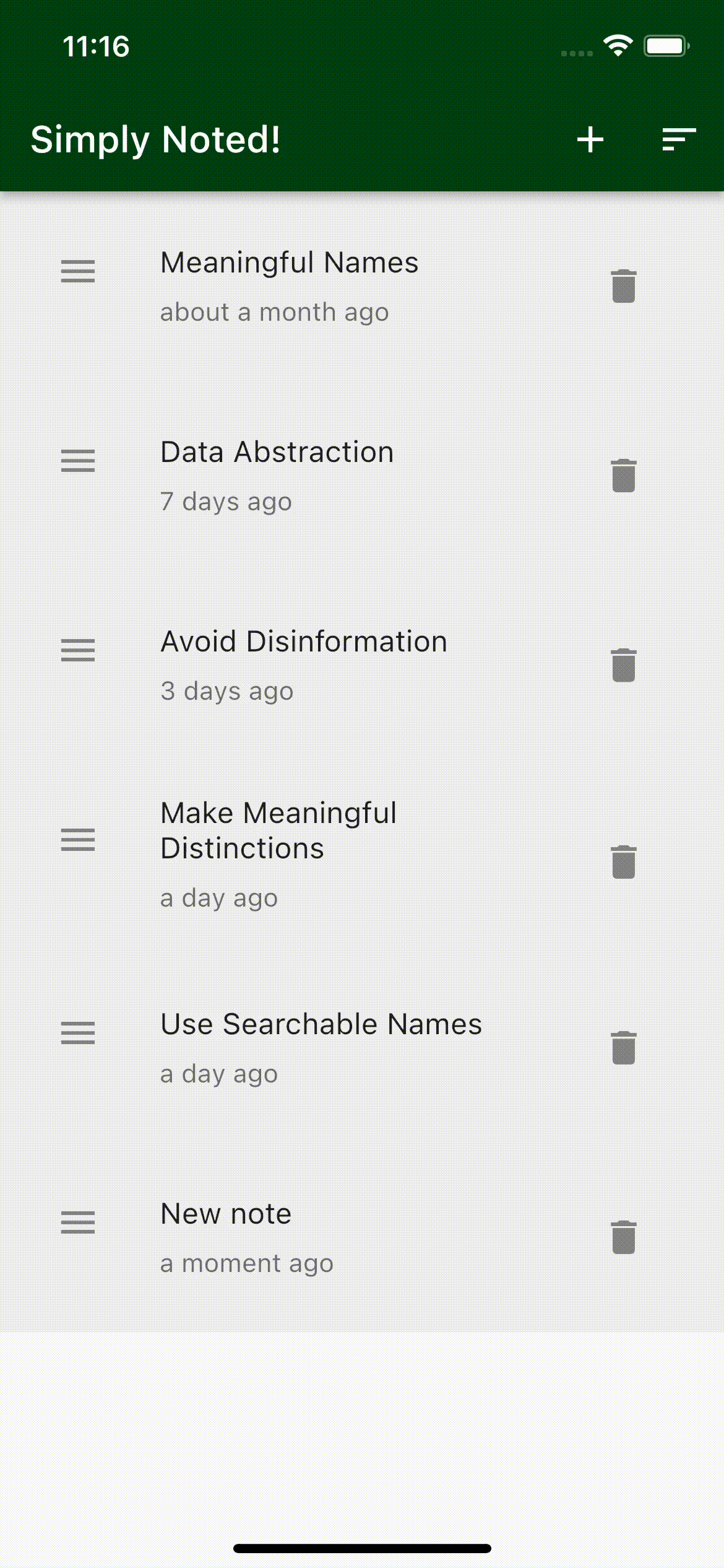
You’ll work on the Simply Noted app, a single-page app that displays a list of notes. Here’s what you’ll be able to do using overlays in flutter:
- Sort notes: View a popup to sort notes by their date of creation.
- Create and modify a note: Open an overlay to create or modify a note.
- Confirm deleting a note: View a confirmation dialog before deleting a note.
- Confirm editing a note: Show a confirmation overlay to confirm editing a note.
Here’s what the app will look like when you’re done:
Now, it’s time to take a look at the starter project.
Setting up the Starter Project
The starter project already contains the logic to save, edit the notes in the cache and retrieve them from the cache.
This tutorial uses Android Studio 2021.1.1. Some of the screenshots are specific to it, but you can also follow along with Visual Studio Code or IntelliJ IDEA.
Open Android Studio and select Open an Existing Project. Then, select the starter folder from the downloaded materials.

Open pubspec.yaml and click the Pub get tab that appears in your IDE, or run the command flutter pub get in the terminal to get the packages:

For this tutorial, the most important files in the project are:
- lib/ui/notes/widgets/sort_notes_icon_widget.dart: The IconButton widget that displays the sort icon.
- lib/ui/notes/widgets/delete_note_icon_widget.dart: The IconButton widget that displays the delete icon.
-
lib/service/router_service/router_service.dart: The service responsible for routing and generating
MaterialPageRoutes. - lib/ui/notes/widgets/note_item_widget.dart: The widget class representing a note in the note list.
Now open lib/main.dart. Then build and run to see the app on your target emulator or device. The app launches with a screen of populated notes:

Now that you know what the starter project contains, you’ll take a deeper look at what overlays are and how you’ll display overlays in Flutter.
Understanding Overlays
Overlays, simply put, are floating widgets on top of other widget children in your app. Flutter has different ways of showing overlays depending on your needs.
The base class for all the routes in Flutter is Route. It’s an abstract class that defines an interface for the Navigator. Routes define methods for handling state change, changes in the stack, and callbacks for when the route is popped.
For Dialogs and Modals, it’s better to keep them consistent and aware of the route. Flutter will then allow you to push an implementation for an abstract PopupRoute to the Navigator using global accessible methods like showDialog, showMenu and showModalBottomSheet.

Viewing the Pop-up Menu to Sort Notes
Instead of having two icons on the app bar for sorting the notes, you want to have one sort icon that displays a popup menu. Flutter provides you with PopupMenuButton; which is a widget that uses showMenu under the hood.

Start by going to lib/ui/notes/widgets/sort_notes_icon_widget.dart and add the following import at the top of the file:
import '../../../data/models/sort_type_model.dart';
Now, you can replace the body of the build method with:
// 1
return PopupMenuButton<SortType>(

  // 2
  icon: const Icon(Icons.sort),

  // 3
  onSelected: (sortType) {

    // 4
    switch (sortType) {
      case SortType.oldestFirst:
        sortNotesByOldestFirst();
        break;
      case SortType.newestFirst:
        sortNotesByNewestFirst();
        break;
    }
  },

  // 5
  itemBuilder: (context) => [
    const PopupMenuItem(
      child: Text('Newest first'),
      value: SortType.newestFirst,
    ),
    const PopupMenuItem(
      child: Text('Oldest first'),
      value: SortType.oldestFirst,
    ),
  ],
);
Here’s the breakdown of the code:
- The build method returns the
PopupMenuButtonwidget which has a type ofSortType.SortTypeis anenumspecifying different types of sorting present in the file that you imported at the top. - You provide a sort icon for the
PopupMenuButtonto display. -
onSelectedis acallbackfunction that you pass, and is triggered when you click the button. It returns an object of typeSortType. - Implement a switch case for the
onSelectedcallback which takes asortTypeas a parameter. In case of having aSortType.oldestFirst, you sort the notes by the oldest, and in case of having aSortType.newestFirst, you sort by the newest. - A builder that builds the items inside of the popup menu. You display a list of two
PopupMenuItems, and provide each with a different value ofSortType.
Build and run; you’ll find that the two sort icons on the app bar have been replaced with the PopupMenuButton.

Now you know how to use PopupMenuButton. Next, you’ll dig a bit deeper and use showDialog directly.
Showing Delete Confirmation Dialog
When deleting a note, you want to show a confirmation dialog to make sure the user wants to delete the note. To do that, head to lib/ui/notes/widgets/delete_note_icon_widget.dart. Add the following code after the build method to DeleteNoteIconWidget:
Widget buildConfirmationDialog(BuildContext context) {
  // 1
  final cancelIcon = IconButton(
    icon: const Icon(Icons.close),
    onPressed: () => Navigator.pop(context),
  );

  // 2
  final confirmDeleteIcon = IconButton(
    icon: const Icon(Icons.delete_rounded),
    onPressed: () {
      onDelete();
      Navigator.pop(context);
    },
  );

  // 3
  return AlertDialog(
    title: const Text('Warning'),
    content: const Text('Are you sure you want to delete this note?'),
    actions: [cancelIcon, confirmDeleteIcon],
  );
}
Here you:
- Create a cancel
IconButtonthat pops the dialog when tapped. Since the dialog will be on top of the navigation stack, closing it is possible usingNavigator.pop - Implement confirm deletion
IconButton. When you tap this IconButton, you callonDelete()function which deletes the selected note and then pop’s the dialog. - Return
AlertDialogwith bothIconButtons,cancelIconandconfirmDeleteIconas list of actions.
Now, replace your build method with the following code:
// 1
return IconButton(
  icon: const Icon(Icons.delete),
  // 2
  onPressed: () => showDialog(
    context: context,
    builder: buildConfirmationDialog,
  ),
);
Here’s what’s happening above:
- You return an
IconButtonthat displays a delete icon. - When you tap the button, it triggers
showDialogand builds the previously createdAlertDialoginbuildConfirmationDialogwidget.
Build and run the app to check that when you tap on the delete icon, and you get a confirmation dialog.

Congratulations! You’ve successfully built an overlay in Flutter: you deserve a pat on the back.
Now that you understand how to use basic methods for displaying overlays in Flutter, let’s dive deeper to understand PopupRoute.