Flutter Accessibility: Getting Started
Learn how to improve the accessibility of your Flutter app by providing more semantic details for screen readers and following other items from Flutter’s accessibility checklist. By Alejandro Ulate Fallas.
Considering Contrast Ratio and Color Deficiency
People with vision impairments often have difficulty reading text that doesn’t contrast with its background. This can be worse if the person has a color vision deficiency that further lowers the contrast.
Your responsibility is to provide enough contrast between the text and its background, making the text more readable even if the user doesn’t see the full range of colors. It also works for individuals who see no color.
The WCAG standard suggests that visual presentation of text and images of text have a contrast ratio of at least 4.5:1. Large-scale text and images can have a contrast ratio of at least 3:1.
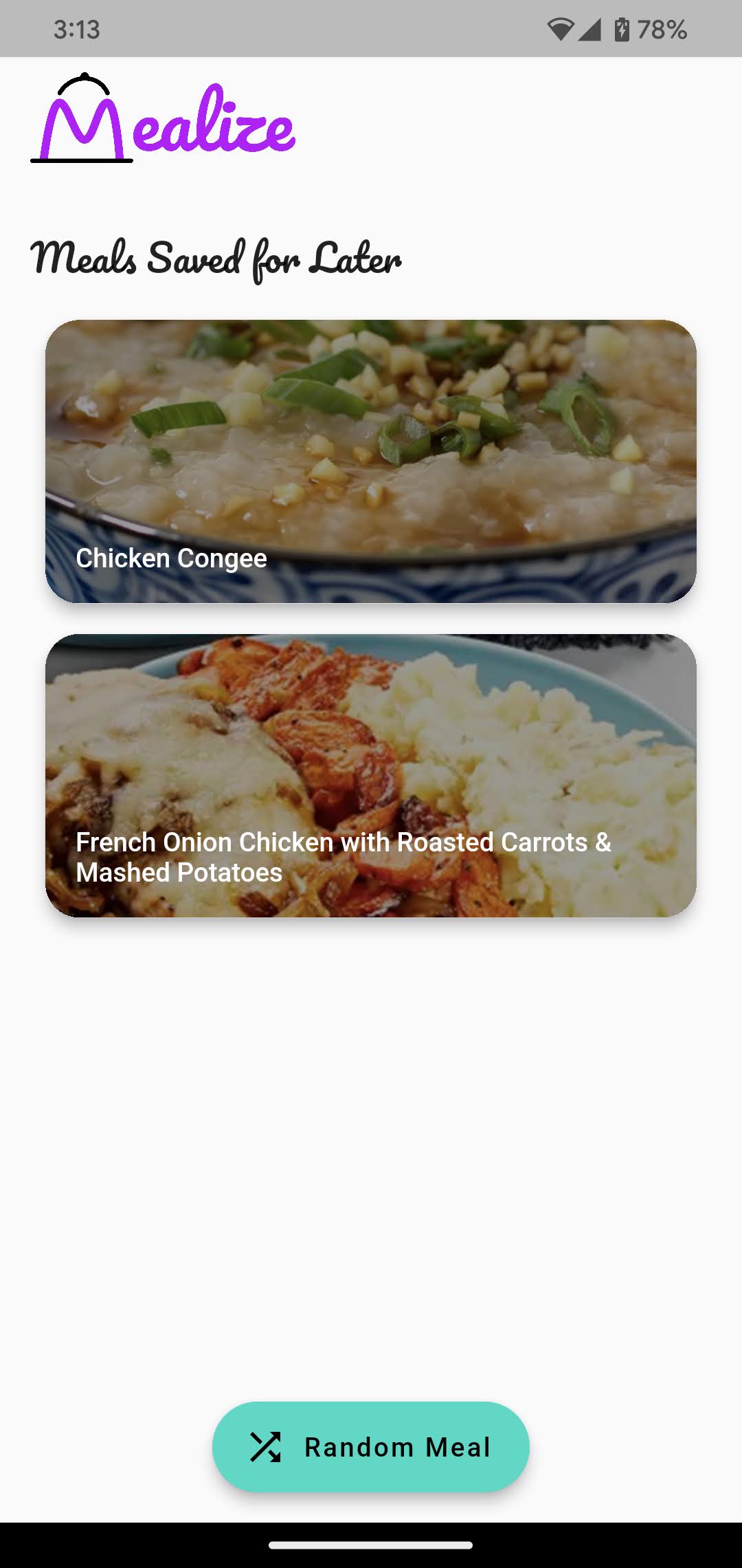
When you open the meal detail page, you see the meal’s name and its image in the header. There’s no contrast management. So depending on the meal, it might be difficult to see the meal’s name. To make matters worse, the font isn’t that legible:

You’ll fix contrast issues now.
Open lib/presentation/widgets/meal_card.dart and replace // TODO: Improve color contrast. with the following code:
colorFilter: const ColorFilter.mode(
  Colors.black45,
  BlendMode.darken,
),
In the code above, you added a black45 filter to the photographs, significantly improving contrast and making the text readable.
Hot reload. Do you see your changes? It’s now easier to read the meal’s name:
Responding to Scale Factor Changes
Most Android and iOS smartphones allow you to enlarge the text and display. This feature is excellent for persons who have trouble reading small fonts or identifying items on the screen.
But that presents a challenge for you as the developer since you need to ensure the UI remains legible and usable at very large scale factors for text size and display scaling.
Now, it might be tempting to add overflow: TextOverflow.ellipsis, or maxLines: 2, to your Texts all throughout your app, but remember that this will only hide information from the user and prevent them from accessing the text.
Allowing horizontal scrolling is another option. This allows the user to read the text but does not address the issue of hidden information. According to James Edwards, a solid rule of thumb is to never use text truncation. With regard to accessibility, vertical scrolling without a fixed header is a good solution.
You must prepare your app’s layout and widgets to grow in size when needed. This ensures that texts remain visible to all and that users can interact with them.
Testing Mealize’s Responsiveness
OK, time to test Mealize’s responsiveness to scale changes. Go to your device’s settings and max out the font scale and display scale (if there is one):
- In Android, open Settings, then go to Accessibility, find and tap on Text and display. Find Font Size and tap on it. Then set the slider to the highest. Now go back to the previous menu and do the same with Display Size.
- In iOS, go to Settings, then tap Accessibility. Find Larger Text and tap on it. Then set the slider at the bottom of the screen to the most.
Reload the app and check if it’s still usable:
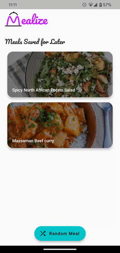
Mealize uses a ConstrainedBox with a minimum height to make MealCard‘s height adjustable. It also uses a ListView when showing the meal’s recipe to allow scrolling without worrying about text size.
Notifying Users on Context Switching
Next, in the accessibility checklist, ensure nothing changes the user’s context without a confirmation action, especially if the user is typing information. Examples you might run into include opening a different app via a deep link or changing screens when typing information.
In Mealize, there’s one example of context switching without confirmation. When you tap Watch Video, you exit the app and open via deep link a separate app with the video (like YouTube or a web browser). This happens without giving a warning to the user, which is not an ideal experience. Take a look:

To fix this, open lib/presentation/widgets/watch_video_button.dart and find the definition for _openVideoTutorial. Change the body to the following:
showDialog<void>(
  context: context,
  builder: (dContext) => AlertDialog(
    title: const Text('Are you sure?'),
    content: const Text('You will exit Mealize and open an external link.'
        'Are you sure you want to continue?'),
    actions: [
      TextButton(
        onPressed: () => Navigator.pop(dContext),
        child: const Text('Cancel'),
      ),
      TextButton(
        onPressed: () => launchUrl(
          Uri.parse(videoUrl),
        ),
        child: const Text('See Video'),
      )
    ],
  ),
);
Reload. Use the app to open the detail page of any recipe, then tap Watch Video under the header. If the meal doesn’t have a Watch Video button, find another recipe by going back to the list and tapping Random Meal.
You should see this dialog:

Undoing Important Actions
Unsteady fingers and visual disabilities can affect users in a big way. Imagine the frustration of tapping a delete button without knowing it’s there. That’s why users should be able to undo important actions.
In the app, removing a meal from the saved meals list displays a snackbar, but it doesn’t allow the user to undo the action. You’re going to fix that now.
Open lib/presentation/widgets/meal_appbar.dart and locate _onRemoveMeal. Change the SnackBar to include action by replacing // TODO: Add undo dangerous actions. with the following code:
action: SnackBarAction(
  label: 'Undo',
  onPressed: () => context.read<DetailCubit>().bookmarkMeal(),
),
This will add an Undo button to the snackbar, which will resave the meal for later.
Hot reload. Check that tapping Undo works as expected. Enable the screen reader again and notice that it announces the snackbar for removing a meal. Here’s what it looks like:
You’ll notice two things:
- The snackbar no longer automatically dismisses.
- The screen reader doesn’t read the Undo button.
The first issue is by design — users with visual impairments might not notice an action. So, the user has to dismiss snackbars with actions.
The second problem is a much more complex topic. Suffice it to say that Flutter ignores SnackBarAction when defining Semantics. So, you’ll need to provide an alternative solution.
Change semanticsLabel on _onRemoveMeal to this:
final semanticsLabel = 'Removed $mealName from Saved Meals list.'
 'Undo Button. Double tap to undo this action.';
Since the framework ignores SnackBarAction, by providing a custom semanticsLabel you’re overriding what the screen reader will announce. Also, since SnackBar and SemanticsService use semanticsLabel, TalkBack and VoiceOver correctly read it aloud.
Hot restart. While using the screen reader, observe that the Undo button is now mentioned when the snackbar shows.
You’ve added extra features to support accessibility in your Flutter app and ensured it stays compatible with screen readers. Great work!