SwiftUI Progressive Disclosures Tutorial
Learn how to dress up your iOS apps with SwiftUI views containing progressive disclosures using state variables, animations and transitions. By Michael Katz.
Sign up/Sign in
With a free Kodeco account you can download source code, track your progress, bookmark, personalise your learner profile and more!
Create accountAlready a member of Kodeco? Sign in
Sign up/Sign in
With a free Kodeco account you can download source code, track your progress, bookmark, personalise your learner profile and more!
Create accountAlready a member of Kodeco? Sign in
Sign up/Sign in
With a free Kodeco account you can download source code, track your progress, bookmark, personalise your learner profile and more!
Create accountAlready a member of Kodeco? Sign in
Contents
SwiftUI Progressive Disclosures Tutorial
25 mins
- Getting Started
- Inserting a View in SwiftUI
- Adding a State Property to Track Selections
- Inserting a Picker Control View
- Adding Another State property to Track Visibility
- Animating SwiftUI Progressive Disclosures
- Adding SwiftUI Progressive Disclosures to a Cell
- Adding Another State Property to Track Cell Selection
- Conditionally Adding a New View
- Adding a Gesture to Trigger the View
- Adding Animations to Improve the User Experience
- Adding Transitions for More Customization
- Matching Transitions to Animations
- Combining Animations and Transitions in SwiftUI
- Admiring SwiftUI Progressive Disclosures
- Showing Sheets
- You Could Use More State
- Viewing the State Sheet
- Adding Toast Views
- Conditionally Displaying a View in a ZStack
- Seeing Your Toast in Action
- Where to Go From Here?
Animating SwiftUI Progressive Disclosures
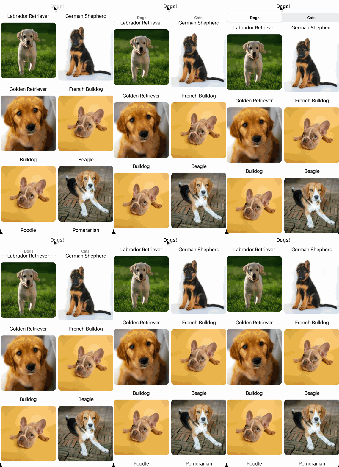
Tapping the button moves the grid down and displays the picker with a sharp transition. You can do better than this by adding a simple animation. Fortunately, SwiftUI makes adding an animation quite easy.
In the Button action block, find:
pickerVisible.toggle()
And replace it with:
withAnimation {
  pickerVisible.toggle()
}
A withAnimation block tells SwiftUI to animate any UI or layout changes in response to any state changing within the block. Build and run, and you’ll see a smoother transition with a little slide and fade-in animation.
You can further customize your view by specifying the animation type and speed in a withAnimation block. For instance, try replacing the previous withAnimation block with the following:
withAnimation(.easeIn(duration: 1)) {
  pickerVisible.toggle()
}
This specifies an easeIn animation curve over one second. “Ease in” means the animation starts slow and gets faster toward the end of the specified duration.
While you’ll see more animations later in this tutorial, you can also check out Getting Started With SwiftUI Animations for a deeper dive into SwiftUI animation.
Adding SwiftUI Progressive Disclosures to a Cell
The basic process of adding views upon state change comprises:
- Creating a new state property to store when you should show the view.
- Adding the view to the hierarchy conditionally upon changes to the state property.
- Adding an action to update the state property.
You’ll now do the same for LazyVGrid‘s cells. When the user taps a cell, the app will show additional information about the particular dog or cat breed selected.
Adding Another State Property to Track Cell Selection
At the top of MainTable, add this state property:
@State var openCell: String = ""
This property keeps track of which cell is currently expanded. It’s a string because it’s important to track whether a cell has been expanded as well as which cell is expanded. As before, add another helper method after loadAnimals(_:) in MainTable:
func isOpen(_ animal: Animal) -> Bool { openCell == animal.id }
Next, you’ll use this helper to determine if a cell should expand or not. It does this by comparing the saved openCell state with the id of an animal object.
Conditionally Adding a New View
To use isOpen to conditionally show a detail view, add the following code after Spacer() in ForEach inside VStack:
if isOpen(animal) {
  ShortDetails(animal: animal)
}
When the user taps a cell, this adds a ShortDetails view to the view hierarchy. This view shows a description loaded from Wikipedia’s abstract for the particular animal displayed, as well as a share button that’s nonfunctional — for now. ShortDetails takes advantage of a helper function, format(_:), to format the description of the dog/cat breed for display in the cell.
Adding a Gesture to Trigger the View
Finally, after the VStack closing brace, add this modifier:
.onTapGesture {
  openCell = isOpen(animal) ? "" : animal.id
}
This creates a tap gesture, which runs the block whenever the user taps one of the animals displayed. This block sets the openCell state to either:
- empty if the cell is already open, causing it to close.
- The new animal’s
id, which expands that cell and closes any other open one.
Build and run to see it in action. Try tapping around the main list to see details about the different breeds.
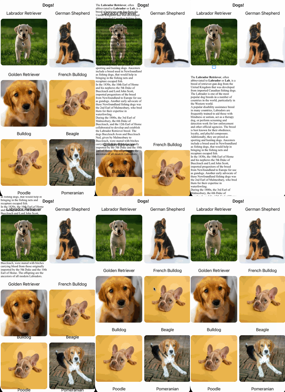
Like with the Easter egg picker, tapping a cell expands the cell’s row to make room for the new view: a description text.
count parameter to the tap gesture, such as .onTapGesture(count: 2) to make it responsive to double-taps. Alternatively, use .onLongPressGesture to display the text with a long-press instead of the tap gesture. Specify the number of seconds needed to trigger the long-press by using .onLongPressGesture(mimimumDuration: Int).
Adding Animations to Improve the User Experience
While the new code works, the view appears without any animation, so it’s a jarring apparition. To get the animation going, first wrap the state change in a withAnimation block. Replace the onTapGesture you just added with:
.onTapGesture {
  withAnimation {
    openCell = isOpen(animal) ? "" : animal.id
  }
}
Build and run. Notice the image row below the selected cell slides down, and the detailed description fades into place.
Adding Transitions for More Customization
There’s no reason to stop there. Through the use of a transition modifier, SwiftUI lets you further customize view insertions and removals. For instance, you can try a slide transition, which slides the view in from the leading edge. To accomplish this, add the following modifier to ShortDetails:
.transition(.slide)
The transition modifier describes how the view transitions in and out of the hierarchy. The slide specifies a leading-edge slide.
Build and run. Now you can see the detailed text view slide in from the left and out to the right.
While this is a fun animation, sliding in from the side isn’t associated with the context of the selected cell. The cell expands downward to make room for the text details, but the details slide in from the left. Instead of using the slide, you can use a move transition to choose which edge the view slides in from.
Matching Transitions to Animations
Replace the previously added transition with:
.transition(.move(edge: .top))
This line moves the text view in from the top when it transitions. Build and run. Notice that the view now slides down from the top. It also disappears by sliding back up. This motion more appropriately matches the expansion animation.
The new animation is a slight improvement, but you can see the text behind the other views on the screen as it slides in from the top — yuck.
Combining Animations and Transitions in SwiftUI
Fortunately, transition has some additional tricks up its sleeve to make this better. You can customize the animation experience by combining different transitions provided through SwiftUI. To make a nicer effect, replace the previous ShortDetails with the following:
ShortDetails(animal: animal)
  .transition(
    // 1
    .move(edge: .top)
      // 2
      .combined(
        // 3
        with: .asymmetric(
          // 4
          insertion: .opacity
            // 5
            .animation(.easeIn(duration: 0.6)),
          // 6
          removal: .opacity
            // 7
            .animation(.easeOut(duration: 0.1)))))
This code mixes together a few different transitions with some animations to get a clean effect. Here’s what the different pieces do:
- This is the same
movetransition as before. Overall, the main goal is to get the detailed text to slide in with the row expansion of the selected cell. - A
combinedtransition allows you to stack two transitions together. You can include any number of transitions just by repeatingcombined. - An
asymmetrictransition lets you specify one transition for the insertion of the view and a separate transition for removal of the view. Here, it specifies different timings so the view disappears much faster than it appears, which looks less weird. - The
insertiontransition here is anopacityone. Opacity will go from completely transparent to opaque over the course of the animation. -
animationis a modifier you can specify on any transition to change its timing curve. Here, you’re using aneaseInanimation that starts slow and gets faster during the course of the specified transition period, 0.6 seconds in this case. - Here, the
removaltransition is alsoopacity. This will hide the view over the course of the animation. - The
easeOutanimation will start fast and slow down at the end, but this time it’s a fast 0.1 seconds in duration.


