
Unreal Engine 5 UI Tutorial
In this Unreal Engine 5 UI tutorial, you’ll learn how to create, display and update a HUD. By Ricardo Santos.
During gameplay, it’s common to need to communicate with the player either by displaying information such as health, score or ammo through text or graphics or by allowing players to make selections or communicate preferences through buttons or lists. This is the User Interface (UI) of the game.
In Unreal Engine 5, you can use Unreal Motion Graphics (UMG) to create User Interfaces. UMG allows you to construct a UI easily by dragging and dropping UI elements such as buttons and text labels, creating both Screen Space UI, which displays on top of the game view or a World Space UI, which appears as an in-game element for weapons or giving information about enemies, for instance.
In this tutorial, you’ll learn how to:
- Create a heads-up display (HUD) that displays a counter and a timer.
- Display the HUD.
- Update the counter and timer to display variable values.
This tutorial is aimed at a beginner level but assumes some familiarity with the Unreal Editor. In case you need some refreshing, please refer to the following:
- Unreal Engine 5 Tutorial for Beginners: Getting Started, by Matt Larson
- Unreal Engine 5 Blueprints Tutorial
- How to Create a Simple FPS in Unreal Engine 5
The above tutorials show the basis of the Unreal Engine Editor, how to create new Blueprints, how to work with blueprint nodes, variables and functions. If you feel at a loss at any time, please refer to them before going forward with this tutorial.
Getting Started
Download the starter project by clicking the Download Materials link at either the top or bottom of this tutorial and unzip it. To open the project, go to the starter project folder and open GeometryCatcher.uproject.
Press Play to control a white cube and try to catch the falling shapes. You can move the catcher horizontally by moving your mouse. After ten seconds, the shapes will stop spawning.
The first thing you’ll do is create a HUD that displays two things:
- A counter that tracks how many shapes the player has collected.
- A timer that displays how many seconds remain until the shapes stop spawning.
You need to use widgets to create all of these.
Using Widgets
A widget is a UI element that provides visual functionality to the UI. For example, a Button widget provides an object that the user can see and click.
The widget itself doesn’t have to be visible. For example, a Grid Panel widget divides its space evenly between its contents. The user can’t see the Grid Panel but can see its effect.

Widgets can also contain other widgets. Here’s an example of a custom widget that contains a Text widget and a Text Box widget:
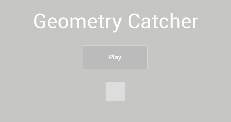
You can even construct a widget to be an entire interface, such as a menu screen. Below is an example of a widget constructed to look like a title screen. All the UI elements are also widgets and are contained within the title screen widget.
Now that you know what widgets are, it’s time to create one for the HUD.
Creating a Widget
Go to the Content Browser and navigate to the UI folder. Click Add New and select User Interface\Widget Blueprint.
After selecting this option, Unreal will display a window asking you what widget class you’d like to create. Click the button User Widgets and rename the new asset to WBP_HUD.
Double-click WBP_HUD to open it in the UMG UI Designer.
The UMG UI Designer
Seven main elements compose the UMG UI Designer:
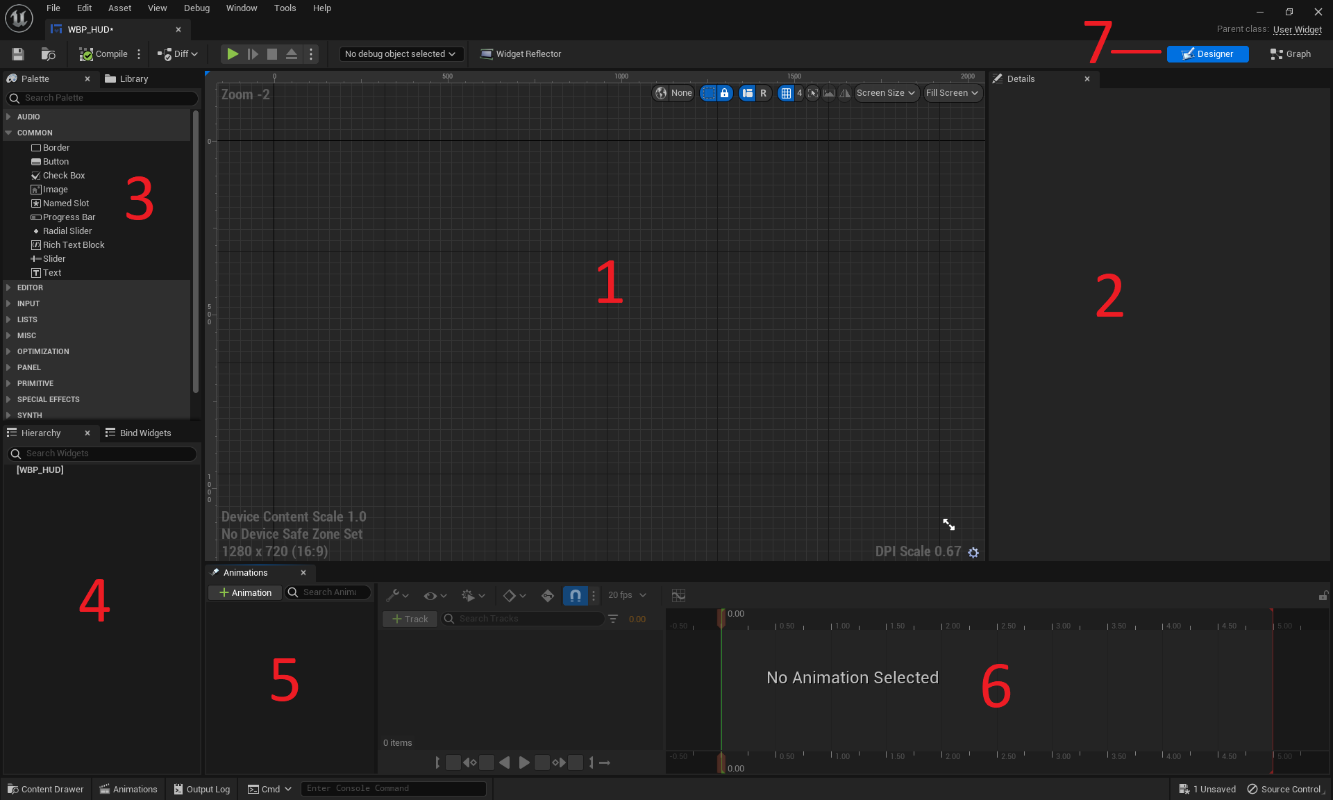
- Designer: This area contains the visual representation of your widget. Pan by holding right-click and moving your mouse. Zoom by scrolling your mouse wheel.
- Details: Any widget you select will have its properties displayed here.
- Palette: A list of all the widgets you can use. Any user-created widgets will also appear here.
- Hierarchy: A list of all the widgets you are currently using.
- Animations: Widgets can have certain properties animated, such as position and size. This panel lists all your animations.
- Timeline: When you select an animation, this panel will display the animated properties and keyframes.
- Editor Mode: Here, you can switch between the Designer and Graph modes. The Graph mode is almost identical to a Blueprint’s Event Graph.
Creating a Text Widget
Text widgets are perfect for displaying numerical information, such as the counter and timer.
As of UE5, the UMG editor does not provide a default container for acting as the root of the UI, so you need a container to fill this role. If you try to insert a Text Widget without a container, the Text Widget will become the root, and the behavior won’t be as expected.
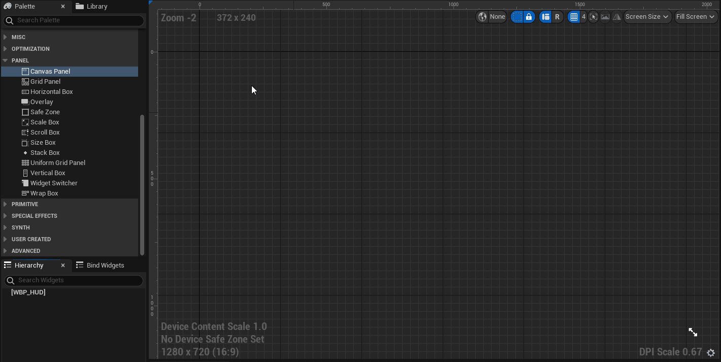
Go to the Palette panel, search for the Canvas Panel widget, and add it to the Designer panel.
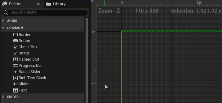
Now, go to the Palette panel and search for the Text widget. Add the widget by holding left-click< and dragging it into the Canvas Panel you placed previously.
Don’t worry about the text content for now, you’ll replace it later.
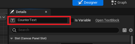
Rename the widget to CounterText. You can do this by selecting the Text widget and going to the Details panel. Type in CounterText into the text box located at the top.
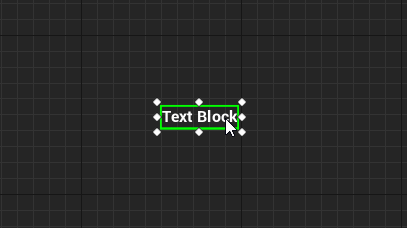
You can move widgets by left-clicking and dragging the widget in the Designer.
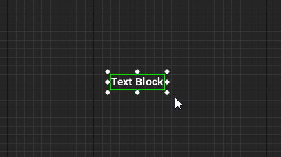
You can also resize widgets by left-clicking and dragging the handles. Resizing allows you to set the bounds for the widget. Unreal won’t render anything outside the bounds.
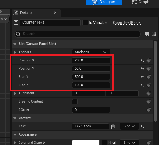
Alternatively, you can set the position and size by modifying the values in the Details panel. Set the following properties and values for CounterText:
- Position X: 200
- Position Y: 50
- Size X: 500
- Size Y: 100
Currently, the text only takes up a small portion of the box.

You can increase the font size by going to the Details panel and navigating to the Appearance section. There is a text box to set the font size at the right of the Font property.
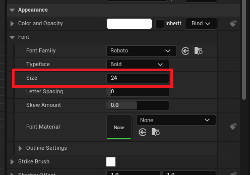
Set the font size to 68.
Let’s make the counter look nicer by adding an icon next to it.